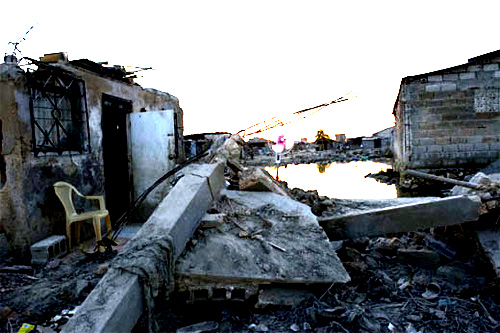
Photojournalist Klavs Bo Christensen was recently disqualified by the Danish Union of Press Photographers from their Picture of the Year prize due to “excessive Photoshop” (via). After the committee reviewed the pictures, they requested his original camera RAW files, before making the determination. Lucky for us, they released a few of the before/after images. Let’s look at one:
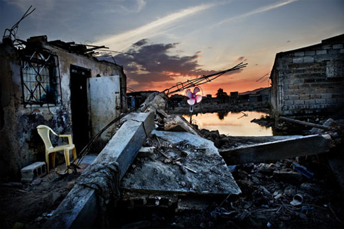
This looks like a pretty spectacular modification, but I decided to see just how much was really being done by attempting to re-create the changes myself. Feel free to fire up Photoshop and play along at home.
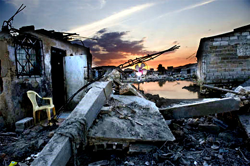
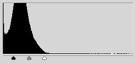 Step 1: Obviously the cornerstone of what’s happening is an increase in contrast. The levels tool allows a photographer to adjust lightness and contrast in a single step. And this single adjustment resulted in the above — an increase in contrast has the natural effect of increasing color saturation, because the contrast is being increased in the individual color channels.
Step 2: Since the ground in the original image is in shadow, the sky is of course much brighter (this is a common issue in outdoor photography), and it’s now blown out. The solution is to mask the above layers adjustment so that it only effects the ground.
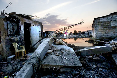
 Step 3: Better, but the sky still looks anemic relative to the rest of the picture, so we apply a second levels adjustment to the areas unaffected by the first. This time the sliders are toward the right of the graph — the contrast is increased by about the same amount, but this time the overall exposure is darkened rather then lightened. Now the image is just about identical with Christensen’s.
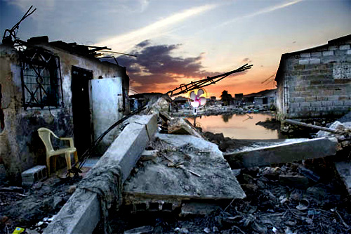
Step 4: Finally, dodged the chair and the window above it just a little, and sharpened the overall result. Save for some nasty jpg compression resulting from modifying images already compressed for the web, the results are remarkably close.
Conclusion: I’m not trying to say that because Christensen’s modifications are trivial to make his photos were disqualified unjustly. Anyone who’s ever played with an image manipulation program and found the contrast adjustment knows it’s trivially easy to make a photo look completely insane and artificial. The question is, how much contrast adjustment is appropriate before an image leaves the realm of photojournalism. Christensen is correct that referring to RAW files is misleading, since digital cameras have their own contrast adjustment, and the RAW files often produce deliberately low-contrast results which do not correspond to the way a scene looked. Additionally, human vision corrects for variations in lighting when looking at the world in a way that it does not adjust for viewing photographs.
What’s striking is the ignorance of digital photo manipulation from the committee. They speak of a wall and some concrete that the photographer has colored blue, which is just wrong — the increase in contrast has brought out the blue shade that was present in the original photograph. A photographer who applied a gentle, more pragmatic levels adjustment would have achieved a commensurately modest shade of blue (which after all is the color that gray concrete takes on in shadows of the early-morning sun). The exact same process is at work in the case of the sweater that appears to turn from brown to red.
I do not deny that for me this set of Christensen’s images crosses the line, but I note that his transgression is a quantitative one, not a qualitative one. His use of masking to modify only one area of the photo was used exclusively to separate the sky from the foreground, a technique no doubt used commonly by photojournalists. So the complaint here can be summed up as “too much stupid contrast.”
(By the way, check out Christensen’s website. Few of the images there exhibit this effect, though the black and white images seem again to be suspiciously high-contrast, to their apparent detriment. His photos of masked Iranian women, however, are spectacular.)