In which I buy a pair of jeans and fail to produce a podcast

I needed a new pair of 501’s because I noticed my old 501’s are developing a hole over the left pocket where my phone always settles plus they look beat up and faded because I’m not a fancy freeze your jeans type, so I went to Sears on my lunch break today. Sears has a surprisingly comprehensive selection of Levi’s, but they’re like milk at the grocery store: stocked at the far corner so you have to walk by everything else to get to them. On the way, I got distracted by the Men’s Perfume section. I’d recently developed an appreciation for perfume bottle design while buying perfume for Hillary, but boy, men’s perfume is really crazy. Did you know they totally have Ed Hardy perfume? Multiple flavors. There’s Antonio Banderas perfume. Like a half dozen rappers have perfumes that are big-time enough to be sold at Sears. And lots of this stuff is in a reasonable $15 to $30 range. I’ve got a sampler sized bottle of Incanto For Men that I got some random way and occasionally I’ll come across it while looking through my desk at work for something and sometimes I’ll put a little on for fun, and plus I’m interested in the bottle designs (and let’s face it, I enjoy buying shit) so I’m seriously considering buying one. Sears keeps sampler bottles out by most of them, so this seems like a not completely impossible thing, and right away I’m drawn to the most conservative bottles (e.g. Hugo Boss) and the most outlandish ones (the aforementioned Ed Hardy), but I’m simultaneously realizing that I need to be sophisticated with this decision, and there are so many choices and none of them seem quite right. Like, this is a decision that needs serious consideration, because I’m not picturing myself ever being a regular perfume wearer and I’m not imagining I’ll be using a large quantity when I do put some on, nothing is more annoying than dudes who walk into a room and you’re accosted by their man perfume. I swear sometimes on South Beach someone will drive by on a fucking moped and you can smell their perfume trailing behind them. But so anyway it’s a big commitment for me, and I want to give this some thought, but then the girl comes over and asks me if I need any help, and I look a little more and then go off looking for my jeans. (Of which, success.) I stop by again on the way back though, that’s how serious I am about this. And I finally decide to just jump in and try the first one I noticed walking up before. Something on the Ed Hardy end of the design spectrum but maybe a little more Gucci aesthetic. Can’t remember the name unfortunately. Anyway it turns out the sampler’s empty? So I go for the Hugo Boss and — no shit — empty again. I’m not sure, but looking at a couple more it seemed like maybe they were all empty, which is a total mystery … like, have they been sitting there so long they’ve all dried out? Does Sears believe in leaving empty unpacked bottles with TESTER written on them out on the shelves helps their sales somehow? And by the way here’s another weird thing: the shelves have the prices printed for each of the bottles, but they’re covered with a strip of plastic that’s got a little sticker that says LIFT HERE FOR PRICE, so you can see the prices but I guess the reasoning is you can’t scan the shelves and get a sense of what everything costs quite so easily?

Anyway, Steve and I totally did record a podcast this week, but we were sorry unprepared and the whole thing meandered something wicked, and the idea of trying to edit something even remotely coherent out of it has thus far been … well, let’s just say it’s not probably going to happen. Better podcast luck next week, when we WILL talk about the disappointments of the Obama administration. Tune in.

A small change that would improve online reading

NY Times snippett

Recently, William Saletan published The Conversion, a wonderful story about the evolution of Mitt Romney’s views on abortion rights. It’s exhaustively researched and long: some 13,000 words, including a video summary and detailed infographic. It spells out revealing information about how Romney processes important political decisions, and sheds light on how complicated and large-looming the politics of abortion are in the US, equally obsessed with religion and personal liberty. It’s the sort of story that so many readers still seek out and cherish, as evidenced by sites like Longform.org, which aggregate relatively long pieces of journalism.

But had you come across the story on Slate’s home page, you would have no way from distinguishing it from, say, this article, a 200-word quick-hit entry about the cars the Romney family drives. The abortion article may have been longer featured on Slate’s home page, and it certainly received more attention on the internet, but a browser of the Slate website or RSS feed would have no way differentiating between the relative weights of these two articles without clicking through.

As we transition from print to online media, this is one of the huge challenges that has yet to be overcome. Reading a physical newspaper is a very particular experience, in part because experienced layout people hand-design every page to give prominence to the material that’s deemed most important, but mostly because you can usually see which articles are longest. The full text of the article is right there. And while attempts to bring a print-like layout to the web have mostly failed, the reader’s need to know what lies behind each link as they scan a web page remains. Many websites have done a good job of identifying links that lead to photo slideshows, infographics, and video content, but for ordinary stories there is no way to tell how long the article is, how much effort the reporter has put in, or how long it’ll take to read.

It’s fantastic that, contra some predictions, the internet has not reduced all online reporting to short blog posts. But making long articles impossible to dinstinguish from short ones places a burden on readers, who treat articles of different lengths in different ways. Many of us spend the morning gobbling short items in large volume in an effort to stay up to speed with the day’s events “water-cooler” topics. We often save longer articles to services like Instapaper and Read it Later for more relaxed reading, perhaps an after-dinner session on an iPad.

instapaper

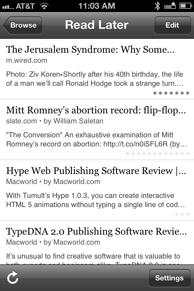
Fundementally, this problem is not difficult to solve. When I designed The Heat Lightning, I incorporated into the traditional blog format a word count for each “read full article” link. The site Longreads provides not just a word count, but an aproximate reading time for each article it aggregates (based on approximately 265 words per minute). A minimal but elegant solution is on display in Instapaper’s iPhone app. A series of gray dots below the short summary of the article indicates aproximate length, three dots for short articles up to a dozen or so for epic pieces. It’s simple and easily scanable, but doesn’t convey the information in a precise way. Then again, you don’t get an exact wordcount by scanning the layout in a printed newspaper either — just a rough visual sense of its length.

As we transition from print to online media, features like these become essential. It’s possible to flip through an entire edition of a daily paper, scanning headlines, skimming some articles and reading others, over breakfast. The same is not true of digital newspapers, because every story is on its own page, and even on a fast internet connection pages take a couple of seconds to load. A typical newspaper home page has hundreds of links, so the inflection point is the click itself. We’ve got a headline and a few lines of summary text in which to make the decision to take the plunge or not.

What we need here is some way to see just a little more of the story before committing to clicking through. Why not show the first couple of paragraphs of a story when the reader’s mouse pointer is over the headline? (The same effect could be accomplished on a tablet by pinching open.)

Over the last five years, many publications have intelligently revamped their websites, creating useful information hierarchies, usable navigation systems, and easily readable content pages. But as we use Twitter and recommendation tools like Longform more and more to find articles to read, the home pages of many publications’ websites are falling into disuse. Adding tools like these, that take into account how readers consume content, would do a lot to make these pages more useful.

An open letter to Oxford Dictionaries and Handmark software on the state of the Oxford iOS apps

[My apologies if this has reached you in error. Writing to large corporations can feel like yelling in the wind, so I’m cc’ing a number of emails in hopes that one may reach a sympathetic ear. Please consider forwarding this to someone who can do something about it.]

Dear Gents:

I’ve purchased several of your iPhone and iPad apps, including the New Oxford American Dictionary. I’m a big fan of the dictionary’s actual definitions, but not a big fan of the app itself. Most frustrating is how many taps it takes from launching the app to getting to look up a word. It’s (1) launch, (2) wait for the search command to appear, (3) tap search (a TINY button?!), (4) tap inside the search box, and (5) tap to delete the previous word looked up.

Un-reasonable, especially for a $29.99 app. If I were making suggestions to you, I’d recommend the app to automatically look up a word if one is in the device’s clipboard, and offer a blinking cursor in a search field upon launch otherwise.

Recently I was looking for a thesaurus app, and noticed your Writer’s Thesaurus. As much as I’d like to own this app ($24.99), I cannot buy it after reading some of the reviews. There’s content missing from the app that exists in the book? There are mini-essays throughout the app that can only be found by stumbling on them? And, most devastatingly, the search is no better than the dictionary app? Sorry, I’ll have to stick to the web browser for word discovery.

I hope you’ll invest some time and energy into improving these (expensive!) apps, so that the user interface is as useful and engaging as the content. And I hope you’ll write me back with your plans in this regard, so I can either begin to wait in anticipation, or put my hopes to rest.

Yours truly,
Alesh Houdek

Update: I actually received a response from Park Jacobs at Handmark (the software partner that produces Oxford University Press’ apps) almost immediately, but haven’t gotten a chance to respond to him or post it until now. Shame on me. Here it is:

Hi Alesh,

My Name is Jacob Park and I am the product manager at Handmark responsible for the Oxford dictionaries on mobile clients. I’d like to thank you for your feedback. We’re always looking to improve the user experience and your feedback is critical.

Your suggestion for automatically searching for text in the clipboard is great and a feature that has been added to the to-do list. The loading time you are seeing while waiting for the search command to appear on launch is a result of some libraries being loaded that are required for the ‘fuzzy’ search functionality. I am looking into what we can do to speed that up to reduce the time from launch to search. The search process you describe below seems to reflect the user experience of the iPad app functioning in portrait mode. Is that correct? I think there may be some relatively easy fixes we can get in that would improve the search functionality, particularly on the iPad, like assuming the user wants to execute a new search when the app is brought to the foreground – clearing out the previous text and displaying the search popover automatically with the search field active. I’ll put these in the feature list for the next point release of the application.

Again, thanks for the feedback. It really is appreciated.

Regards,
Jacob

I’m on a panel: “New Paradigms in Communicating Design Culture”

This Wednesday I’ll be part of a panel discussion, and no, it’s not at SXSW. It’s at MoCA, and it’s about, I guess, contemporary digital design, social media, and architecture? The info is on Facebook, I’m reproducing it here for those who haven’t seen it. There’s also an e-flyer, and here is the sparsely populated MoCA link. Come by and say hi!

New Paradigms in Communicating Design Culture
‘Time for Design’ Panel Discussion at MOCA – moderated by Armando Montilla

7 pm, Wednesday, March 17, 2010
Museum of Contemporary Art, North Miami
770 NE 125th Street North Miami, FL 33161

Traditional ways of communicating design though printed media now share their role in communicating the culture of design with subversive/alternative publishing means such as blogs and social networks sites. Physical versus virtual, high-institutionalized versus low-alternative; and individual versus collaborative are the new paradigms in communicating design culture in times of financial challenges.

This event will suggest Mediation and Subversion as means of spreading Design Culture, in the format of discussion panel with short (5 min. max.) visual presentations included, within the frame of the ‘Time for Design’ Discussion Panel Events at MOCA.

The underlined questions of the discussion will be:

1. Can we go beyond traditional means of mediation in architectural design such as printed publications?

2. Can we promote a good design-oriented culture through the use of Internet blogging at the present lacking of available funding to produce publications?

3. What could the role of sub-cultures in the city to promote ‘unappreciated’ aspects of innovative design?

4. How can we have a participative ‘design community’ exchange using virtual/non-traditional means?

5. How can we activate community participation in collective design efforts?

The discussion will also aim to: “[The] identif[ication of] different actors in the mediation process of the city, particularly in what refers to the realm of contemporary artists, urban hackers and para-architects dealing with media and the city…[..]…‘Wiki’ collaborative modes and ‘Smart Mob’ organizational strategies, not only lead to physical manifestations in real space – such as the so-called ‘Flash Mobs’ – but also enable bottom-up, edge-in social innovation in times of financial hardship and environmental consciousness. How are these platforms envisioned by designers today in search of social impact in the city? What are architects to learn from the field of contemporary art at the level of capacity to mediate with different actors in the city? …[…]…how can designers learn from the latest field of digital techniques and prototyping, in order to allow collective authorship to come into the realm of collaborative design?” Link

List of Panelists:

1. Damir Sinovcic, Editor, South Florida Design Book Magazine and Principal of Liquid Design in MIami

2. Elite Kedan, Architect, Faculty at FIU School of Architecture, Editor of the recent Book: Provisional: Emerging Modes of Architecture Practice in USA

3. Eric Goldemberg, Faculty at FIU School of Architecture, Principal of MONAD Studio in Miami, and Editor of the forthcoming book “Pulsation in Architecture”, a Catalogue of the accompanying same name upcoming Exhibit.

4. Michael Alfonso, Graphic and Web Designer, editor of the Site The Graphic Gospel

5. William Virgil, former Grafitti Artist, who has now gone into graphics and into underground pop sub-cultures. Partner of ABSOLELUTE, a company producing custom laser printing on Sneakers

6. Alesh Houdek, Internet Blogger of the Site Critical Miami and Buildings and Food

7. Martha Skinner, Assistant Professor at Clemson University School of Architecture and a graduate of the University of Florida; who has been very active in interactive projects involving Social Networking Sites and the community

Moderator:

Armando Montilla, Assistant Professor of Architecture, History & Theory and Criticism at Clemson University School of Architecture

New college

Clay Shirky asks: If you were going to found a new college today, what would you do? Answers here. My contribution: “A pretty modest change to the college system would be to knock down the barriers between departments and schools. Let students use whatever resources they can justify for whatever ends they can defend. Also, require anyone to start a blog at least 6 months before admission — a public forum for what you hope to accomplish, and a log for what’s happening as you succeed or fail — permanently accessible to school admin, professors, and the world.”

Apple Tablet

Apple Tablet. Pretty cool, and very close to what I requested in an e-reader. But the problem with this is the same problem the iPhone has (exacerbated by the big screen) — you forget that you’re not using a “real” computer, and you keep getting frustrated by the stuff you can’t do. Which is anything to do with real typing. And forget about plugging in an external keyboard, because then the touch-screen becomes very awkward to use. Also, the big piece of glass that makes up its face is going to make this a very fragile object in any situation other then sitting on the couch. If this is really what’s coming, I worry that it’ll be Apple’s Segway — a beautiful and inspiring device that isn’t useful beyond a few specific niche markets.