Czech typing on a Mac

If you’re a full-time or part-time Czech typist with a Mac you’ve got a the Czech keyboard enabled in your Language & Region Keyboard preferences and you’re skilled at using the alternate keyboard layout (which assigns the special Czech characters to the number keys and also shuffles the punctuation around and might swap your Y and Z keys).

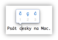
A few years ago macOS introduced popovers for accented characters. Hold down the S key on your keyboard and you get a little bubble with options for alternate letters from various languages. Unfortunately Czech is not included. A few of the special Czech characters are in there because they’re the same as in one of the languages that’s supported, but good luck typing “Ď”. What’s particularly galling, there’s no easy way to modify these popovers. No setting, and not even a third-party utility to edit these that I know of.

It turns out there is a way to do it, but it ain’t easy. There’s a plist file buried in the system files you can edit, but doing so requires rebooting your computer a few times to disable and then re-enable System Integrity Protection.

Warning: Don’t do this. You might mess up your computer. These steps worked for me on a Mac running Sierra, and similar steps may or may not work on other systems. You’re on your own.

  1. The file you’re looking for is /System/Library/Input Methods/PressAndHold.app/Contents/PlugIns/PAH_Extension.appex/Contents/Resources/Keyboard-en.plist. (On other systems it might be /System/Library/Input Methods/PressAndHold.app/Contents/Resources/Keyboard-en.plist or something else.) If you’re looking for this file you may have to right-click and select “Show package contents” once or twice.
  2. Make a copy of this file somewhere else. Heck, make two: one to edit, one as a backup if things go sideways.
  3. You can open this file in a text editor and make changes. Or you can download my version of it (Keyboard-en.plist) but be extra-careful to make sure the format matches, especially if you’re on an os version other than Sierra.
  4. Now, to replace the file with your edited version, you need to disable System Integrity protection. Reboot while holding down Command-R, select Terminal from the Utilities menu, and type csrutil disable. Then reboot back into your computer.
  5. Drag the edited file into the folder location and select “replace.” The changes should take effect immediately, so you can try holding down the D key in a text field and see if you get a Ď popup.
  6. To re-enable SIP, repeat step 4 but with the command csrutil enable.

More about System Integrity Protection here, and more about disabling it here. For a much easier way to type Czech characters, you can visit the online Czech typing page. Thanks to scilling on DuoLingo for suggesting this.

Deploying a Laravel application to DreamHost shared hosting, 2018 edition

Unfortunately, this sort of information changes regularly. Google “dreamhost laravel” and you’ll get some articles from a few years ago which, while helpful, were not sufficient for me. A few examples:

Shockingly, DH’s Knowledge Base is silent about Laravel. Here’s what ended up working for me. If you’re trying to follow these instructions and something is unclear or does not work, please reach out.

Step 1: Add a domain

In the DH panel, click Manage Domains and Add Hosting to a Domain/Sub-domain. I bet it’s possible to get this working in a directory of an existing domain, but DH lets you add unlimited subdomains so why not create a new one for your app? Under Web directory, add /public to the end of the domain name. Set PHP mode to 7.1 FastCGI. You’ll probably also want to select HTTPS and Create a New User.

Step 2: Create a database

Click Goodies and MySQL Databases. Scroll to the bottom of the page to Create a new MySQL database. Type in a database name. Note down the name, the hostname, and the user. Click Add new database. Then find the database in the list (or any other database in there that has the same user) and click on the user’s name. Click Show and note down the password. While you’re in there, you should add your current computer’s IP address to the list of allowable hosts; that’ll allow you to inspect your database from your local machine with something like Sequel Pro.

Step 3: Upload your files

You can’t run Composer on a DH shared hosting plan, so upload your complete project from your local development environment, vendor folder and all. (Do not upload any files or folders that starts with a dot, like .env or .git. Also don’t upload your node_modules folder, if you have one.)

Step 4: Set up .env

Copy the .env file from your project folder to a place you can edit it. (To see hidden files on a Mac, type Command-Shift-. in the Finer. Repeat the command when you’re done.) Edit the lines for DB_HOST, DB_DATABASE, DB_USERNAME, and DB_PASSWORD with the info from step 2. Upload the file to the project root folder.

Step 5: Migrate your tables

SSH into your DH server: from your local command line, type ssh -l [user] [domain]. The user and domain are the ones you created in step 1, which is separate from the database user! CD into the root of the project folder. At this point, if you run php -v you will not get version 7.1 even though you selected it for the domain, go figure!

Type php-7.1 artisan migrate. This may work, but in my case, I got an error to the effect that 1071 Specified key was too long. This issue can be solved by updating your AppServiceProvider file by adding Schema::defaultStringLength(191); to the boot() function and use Illuminate\Support\Facades\Schema; to the top. Now when you run php-7.1 artisan migrate you’ll get a different error message, because you’re trying to re-create tables that were created last time before the error?

You can probably do php-7.1 artisan migrate:refresh but this is where I logged into Sequel Pro and just deleted all the existing tables. At that point, php-7.1 artisan migrate worked, creating all my tables, and my application was working!

Done!

Again, if you’re trying to follow these instructions and something is unclear or does not work, please let me know.

Update: Lots of good details about this at the Laracasts thread for this post.

Why this is a good year to read the Notes of Debates in the Federal Convention

In 1787 the founding fathers were busy down at the Philadelphia Convention drafting the US Constitution. This was not an uncontentious meeting, as we all know. The best record we have of the daily debates that led to the final document is James Madison’s personal journal.

This is a like more or less daily account from mid-May to mid-September. (Fun fact: they kept the windows of Independence Hall closed despite Philadelphia Summer because they were afraid of people eavesdropping from the street.)

A fun thing you can do any year is to read these in real time, every day’s entries on that day. (The length is manageable, and in any case, you can always skim?)

The fun thing about 2018 is that the days of the week line up, so if you’re reading the entry from Monday, May 28th, you’ll be reading it on Monday, May 28th.

Find the notes here.

Michael Pollan: A Place of My Own

a place of my own, michael pollan, first edition

This one is for Michael Pollan fans; all others should seek out Omnivore’s Dilemma and dive in. In this book Pollan builds a building for himself to write in, with lots of help. He’s got a house with some land out back, a forested hill that overlooks the main building and backyard garden, and he’s transitioning to working from home. Who wouldn’t want a shed to retreat to that’s dedicated to their particular job/hobby?

Of course this could have been a quick and easy project, but Pollan’s got two ideas: (1) this is going to be a custom-made affair, and (2) he’s going to do as much of the physical building as possible.

What follows is sort of two books. In one, there’s the beautifully told story of the process of designing and building the thing. The book is chronological, and flows from ideation, design, and site selection to the physical building, with the foundation, walls, roof, and windows each getting a chapter. Each section is interspersed with reflection grounded in research on the history and philosophy of buildings. In a few places the two dovetail beautifully, and that’s when the book is at its best. I really did learn things about the relationship between human beings and our architecture here, and I think I experience buildings differently after reading it.

There’s also a pretty funny drama that unfolds between Charlie, the building’s architect, and Joe, the tradesman Pollan hires to help him do the construction. Turns out builders and carpenters are frequently at odds with architects, who’s relationship to their shared product is a bit more abstract. Pollan starts out fully affiliated with the architect with whom he dreamed up this building, but over the course of the book, his allegiance gradually shifts. Here’s a favorite bit:

By the time Joe and I headed into the second winter of construction, our work together, even though it amounted to something less than one day a week, had acquired its own particular rhythms and textures and talk. Joe reveled in playing the role of mentor to my eager if still-somewhat maladroit apprentice, except for the occasional period of sulking, when he would temporarily revert to sullen clockpuncher. These episodes were invariably occasioned by a suggestion from me that we should perhaps consult the blueprints before undertaking framing a window opening or hanging a door. “You mean the funny papers,” Joe’d grumble. “Well, you’re the boss,” he’d shrug, egging me to take control, or sides; I never was quite sure which. But in time such episodes became more rare, for as my own confidence as a carpenter grew, I was less inclined to regard Charlie’s drawings as revealed truth, much to Joe’s satisfaction.

Working outside in the brief, chill days of December had a way of hurrying this process along. Architectural plans look different in the cold, especially when you’ re rocking stiffly from boot to boot on top of fossilized mud, dispatching neural messages to toes and fingertips that go unheeded, and struggling to interpret lines on a drawing that only seem more ambiguous the harder you stare at them. Joe, can you see any framing to hold up that window? Nope, not a stick. Looks like he wants us to levitate that one. Under such circumstances the solidarity of carpenters is bound to intensify. After a while you can’t look at the blueprints—which by now have had their pristine geometries smudged by a parade of muddy thumbs—without thinking about the comfortable office in which they were drawn, the central heating and scrubbed fingernails and steaming pots of coffee.

The book is sprinkled with wonderful architectural diagrams and (at least in the first-edition hardcover I got from the library) very few images of the finished structure.

Lots of reviewers complained about some of the theoretical and historical sections of the book, but from reading these reviews I get the strong impression that everyone responded positively and negatively to different sections, so I don’t think you can skip the “boring” bits. For example, I found the bits explaining the differences between modernism and post-modernism pretty enlightening, and they resonate through the rest of the book

I enjoyed this book a great deal, and I think the reason has as much to do with my relationship with the writer as anything. I’ve read a bunch of his books, and one I listened to as an audiobook read by Pollan himself. Having access to the author’s voice and personality like that makes reading feel much more like listening. Seriously, I wonder what it would be like to read Moby Dick if there was even a 10-minute recording of Herman Melville talking to be heard.

Here are a few relevant links:

In which I buy a pair of jeans and fail to produce a podcast

I needed a new pair of 501’s because I noticed my old 501’s are developing a hole over the left pocket where my phone always settles plus they look beat up and faded because I’m not a fancy freeze your jeans type, so I went to Sears on my lunch break today. Sears has a surprisingly comprehensive selection of Levi’s, but they’re like milk at the grocery store: stocked at the far corner so you have to walk by everything else to get to them. On the way, I got distracted by the Men’s Perfume section. I’d recently developed an appreciation for perfume bottle design while buying perfume for Hillary, but boy, men’s perfume is really crazy. Did you know they totally have Ed Hardy perfume? Multiple flavors. There’s Antonio Banderas perfume. Like a half dozen rappers have perfumes that are big-time enough to be sold at Sears. And lots of this stuff is in a reasonable $15 to $30 range. I’ve got a sampler sized bottle of Incanto For Men that I got some random way and occasionally I’ll come across it while looking through my desk at work for something and sometimes I’ll put a little on for fun, and plus I’m interested in the bottle designs (and let’s face it, I enjoy buying shit) so I’m seriously considering buying one. Sears keeps sampler bottles out by most of them, so this seems like a not completely impossible thing, and right away I’m drawn to the most conservative bottles (e.g. Hugo Boss) and the most outlandish ones (the aforementioned Ed Hardy), but I’m simultaneously realizing that I need to be sophisticated with this decision, and there are so many choices and none of them seem quite right. Like, this is a decision that needs serious consideration, because I’m not picturing myself ever being a regular perfume wearer and I’m not imagining I’ll be using a large quantity when I do put some on, nothing is more annoying than dudes who walk into a room and you’re accosted by their man perfume. I swear sometimes on South Beach someone will drive by on a fucking moped and you can smell their perfume trailing behind them. But so anyway it’s a big commitment for me, and I want to give this some thought, but then the girl comes over and asks me if I need any help, and I look a little more and then go off looking for my jeans. (Of which, success.) I stop by again on the way back though, that’s how serious I am about this. And I finally decide to just jump in and try the first one I noticed walking up before. Something on the Ed Hardy end of the design spectrum but maybe a little more Gucci aesthetic. Can’t remember the name unfortunately. Anyway it turns out the sampler’s empty? So I go for the Hugo Boss and — no shit — empty again. I’m not sure, but looking at a couple more it seemed like maybe they were all empty, which is a total mystery … like, have they been sitting there so long they’ve all dried out? Does Sears believe in leaving empty unpacked bottles with TESTER written on them out on the shelves helps their sales somehow? And by the way here’s another weird thing: the shelves have the prices printed for each of the bottles, but they’re covered with a strip of plastic that’s got a little sticker that says LIFT HERE FOR PRICE, so you can see the prices but I guess the reasoning is you can’t scan the shelves and get a sense of what everything costs quite so easily?

Anyway, Steve and I totally did record a podcast this week, but we were sorry unprepared and the whole thing meandered something wicked, and the idea of trying to edit something even remotely coherent out of it has thus far been … well, let’s just say it’s not probably going to happen. Better podcast luck next week, when we WILL talk about the disappointments of the Obama administration. Tune in.

A small change that would improve online reading

NY Times snippett

Recently, William Saletan published The Conversion, a wonderful story about the evolution of Mitt Romney’s views on abortion rights. It’s exhaustively researched and long: some 13,000 words, including a video summary and detailed infographic. It spells out revealing information about how Romney processes important political decisions, and sheds light on how complicated and large-looming the politics of abortion are in the US, equally obsessed with religion and personal liberty. It’s the sort of story that so many readers still seek out and cherish, as evidenced by sites like Longform.org, which aggregate relatively long pieces of journalism.

But had you come across the story on Slate’s home page, you would have no way from distinguishing it from, say, this article, a 200-word quick-hit entry about the cars the Romney family drives. The abortion article may have been longer featured on Slate’s home page, and it certainly received more attention on the internet, but a browser of the Slate website or RSS feed would have no way differentiating between the relative weights of these two articles without clicking through.

As we transition from print to online media, this is one of the huge challenges that has yet to be overcome. Reading a physical newspaper is a very particular experience, in part because experienced layout people hand-design every page to give prominence to the material that’s deemed most important, but mostly because you can usually see which articles are longest. The full text of the article is right there. And while attempts to bring a print-like layout to the web have mostly failed, the reader’s need to know what lies behind each link as they scan a web page remains. Many websites have done a good job of identifying links that lead to photo slideshows, infographics, and video content, but for ordinary stories there is no way to tell how long the article is, how much effort the reporter has put in, or how long it’ll take to read.

It’s fantastic that, contra some predictions, the internet has not reduced all online reporting to short blog posts. But making long articles impossible to dinstinguish from short ones places a burden on readers, who treat articles of different lengths in different ways. Many of us spend the morning gobbling short items in large volume in an effort to stay up to speed with the day’s events “water-cooler” topics. We often save longer articles to services like Instapaper and Read it Later for more relaxed reading, perhaps an after-dinner session on an iPad.

instapaper

Fundementally, this problem is not difficult to solve. When I designed The Heat Lightning, I incorporated into the traditional blog format a word count for each “read full article” link. The site Longreads provides not just a word count, but an aproximate reading time for each article it aggregates (based on approximately 265 words per minute). A minimal but elegant solution is on display in Instapaper’s iPhone app. A series of gray dots below the short summary of the article indicates aproximate length, three dots for short articles up to a dozen or so for epic pieces. It’s simple and easily scanable, but doesn’t convey the information in a precise way. Then again, you don’t get an exact wordcount by scanning the layout in a printed newspaper either — just a rough visual sense of its length.

As we transition from print to online media, features like these become essential. It’s possible to flip through an entire edition of a daily paper, scanning headlines, skimming some articles and reading others, over breakfast. The same is not true of digital newspapers, because every story is on its own page, and even on a fast internet connection pages take a couple of seconds to load. A typical newspaper home page has hundreds of links, so the inflection point is the click itself. We’ve got a headline and a few lines of summary text in which to make the decision to take the plunge or not.

What we need here is some way to see just a little more of the story before committing to clicking through. Why not show the first couple of paragraphs of a story when the reader’s mouse pointer is over the headline? (The same effect could be accomplished on a tablet by pinching open.)

Over the last five years, many publications have intelligently revamped their websites, creating useful information hierarchies, usable navigation systems, and easily readable content pages. But as we use Twitter and recommendation tools like Longform more and more to find articles to read, the home pages of many publications’ websites are falling into disuse. Adding tools like these, that take into account how readers consume content, would do a lot to make these pages more useful.

What to do when you’ve decided to be an artist

Recently, I came back across Walter Darby Bannard’s Aphorisms for Artists — 100 short “chapters” of observations, quips and warnings. They are meant to and indeed do inspire thinking about what is valuable in art, but they espouse a very particular conception of art. Bannard believes that art is a purely visual experience, and that the creation of art is almost solely about the materials. He’s an abstract expressionist painter, and post modernism is his enemy, where post-modernism is taken to include almost all of the art created by contemporary artists. I find this view peculiar and limiting, but I do enjoy living in it off and on. And I think that the contemporary approach to art making, which thrives on playing with meaning as much as materials, on mixing generes and media, and on voraciously devouring as much of the world for incorporation into art, will find much to use here.

Chapter 59. Making art is not risky.

Any true artist will immediately object to this. Why? because making art feels so risky. After all, you are putting heart and soul on the line.

When you are serious about your art, every perceived little success must be preserved, every perceived failure is a testament to your abject lack of talent, and every hesitant, anxious new stroke of paint betrays your meager ability and exposes you to ridicule.

Put a stop to this. When making art forget you are making art. Tell yourself you are working with a few dollars worth of disposable materials, trying to make something you and maybe some others will like to look at, something nice to pass the time.

It probably won’t work, but it’s worth a try.

I spent a couple of days reading through these, and during that time came across an interview of Ornette Coleman being interviewed by Jacques Derrida. As the pioneer of free jazz, Coleman is Bannard’s ally. As the de-facto inventor of post-modernist deconstructive analysis, Derrida is more or less his proclaimed nemesis. The interview was conducted in 1997, some 35 years after the release of Coleman’s first seminal works. It was conducted in English and published in French, but the original transcript was lost so this edition is the French translated back into English.

JD: Do you think that your music and the way people act can or must change things, for example, on the political level or in the sexual relation? Can or should your role as an artist and composer have an effect on the state of things?

OC: No, I don’t believe so, but I think that many people have already experienced that before me, and if I start complaining, they’ll say to me, “Why are you complaining? We haven’t changed for this person that we admire more than you, so why should we change for you?” So basically I really don’t think so. I was in the South when minorities were oppressed, and I identified with them through music. I was in Texas, I started to play the saxophone and make a living for my family by playing on the radio. One day, I walked into a place that was full of gambling and prostitution, people arguing, and I sara a woman get stabbed — then I though that I had to get out of there. I told my mother that I didn’t want to play this music anymore because I thought that I was only adding to all that suffering. She replied, “What’s got hold of you, you want somebody to pay you for your sould?” I hadn’t thought of that, and when she told me that, it was like I had been re-baptized.

There’s something funny going on there at the end. The idea was either fuzzy to begin with, or likely it’s gotten mangled in re-translation. I do not mean to say that these two pieces are in any way two ends of a spectrum, or that they offer two diverging points of view, but merely that they signify an interval, and that there is something to be taken about their relationship to each other, and their mode of creation, and their ability to evoke something useful in the mind of the reader. As the saying goes, there’s a lot of reality in there.

Update: Franklin Einspruch and Walter Darby Bannard respond and clarify their positions. Franklin and I (with many many others) had a lot of debates about this stuff in the old days of Artblog. Good times. Needless to say that Franklin and Darby are much smarter about art than me, and spend a lot more time than me thinking about this stuff, and you will find their positions persuasive.

Also note that comments are fixed and re-enabled.

Should I buy an iPad to replace my computer?

the new iPad

There is very little that’s interesting to say about the new iPad. I’d sum it up this way: the iPad’s always been wonderful, and the new model improves the screen, one of the few things that was left to improve about previous models. (Still to go: the weight.)

Should you buy one? If you’re like most of us, and you use your computer mostly for browsing the web, absolutely. The iPad is a pleasure, and it goes places where we read (couch, bed, standing in the kitchen, bathtub) more gracefully than a laptop ever can.

Someone asked me today whether to buy an iPad to replace a dying laptop, and that’s a tougher question. There are still things that are infuriatingly difficult to do on an iPad. Try downloading a Microsoft Word document from the web, editing it, and emailing it to someone. It can be done, but if you’re the sort of person to consider having an iPad as your only computer, you’re probably not one to fiddle and work at figuring out things like this.

(For the record, here’s how: Download the file with a web browser that allows downloads, such as Atomic Web. Use Atomic Web’s file manager to transfer the file to Dropbox. Use a Dropbox and Office-compatible editor such as Documents to Go to edit your document. Finally, use an app such as GoodReader, which has the ability to attach files to outgoing messages, to send your email.)

But for 90% of what we use computers for, the iPad is just all-around better. And the cincher is the battery life, which aside from plugging it in at night you never have to think about. I ordered my iPad 1 the day it was announced, replaced it as soon as the iPad 2 was announced, and Ordered my new iPad Wednesday. (I’ve bought the $499 model each time, and managed to sell it on ebay for around $400 right before the new model’s announced. A few weeks without an iPad makes me appreciate the new one when it comes.)

From ‘Facts for Republicans’: the presidency and gas prices

Having little else to attack Barack Obama for, FOX News is beating him up for rising gas prices, going so far to use blatantly misleading charts.

The good news is that FOX themselves made the argument that the president has very little influence over gas prices — during the George W. Bush administration. Check it out: