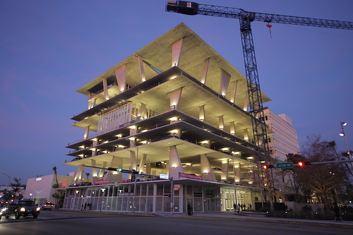
Herzog & de Meuron’s 11111 project recently opened on the west end of the Lincoln Road pedestrian mall. It’s a shocking structure — large, raw, and unfinished looking (there is some ongoing construction on the top levels, but the basic appearance is as it will be). The architects were able to pull variances, convincing government officials that the size of the building was determined by aesthetic reasons, but an effort to maximize capacity. And indeed, several of the levels are soaringly high, while others have the cramped height of a standard parking garage.
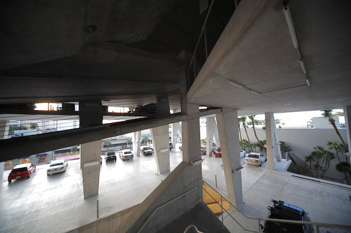
The building is “mixed use,” though the majority of it is open and designated for parking (currently $15 flat rate, and well utilized). The “its a garage” mindset may explain how this project was sold to planners and citizens, since there is precedent on South Beach for unusual garages (and anyway there is a pretty universal agreement that parking garages should be ugly). But I suspect that many residents are horrified by it, and this makes it all the more delicious.
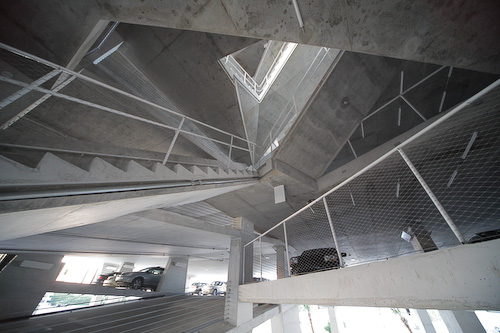
The core of the building is a completely unconventional staircase, with every level blending into the next, attached with concrete stairs that jut in chaotic directions. Generally the details do not play up the under-construction thing, but do note the safety-mesh like steel wire on the railings (it is actually very high-quality braided wire).
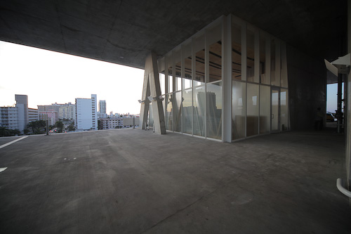
Most of the retail is on the ground floor, with one solitary (and unfinished) location on the 5th floor. There is also some residential space on the top floors, but this is still under construction and probably off limits for good. The horizontal cables that make up the guard rails are set back a foot or two from the ledges, and they tend to disappear, creating spectacular vistas.
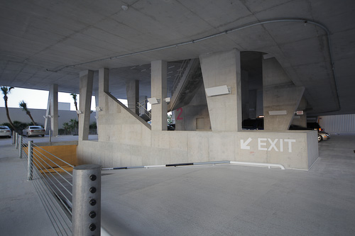
The lighting and other metal details are stridently mimimal, and most of the signage is painted onto the building in oversize Helvetica. The whole thing comes across as a monument against design-by-committee.
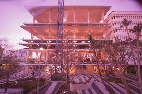
A view from the rose-colored windows of the movie theater across the mall. One of the best aspects of the project is Herzog & de Meuron’s transformation of the pedestrian area for a block or two around the project. They brough in black and white stone and created a slightly irregular surface, with landscaping inspired by the Everglades.
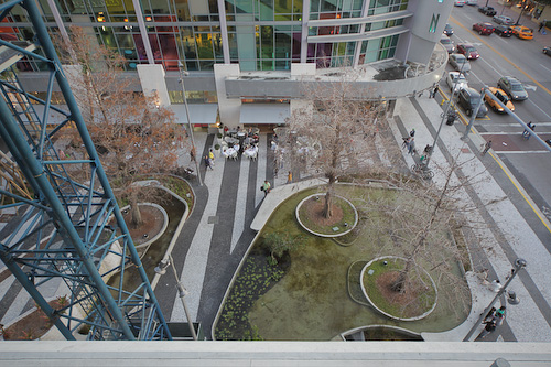
There is probably more going on with the planters then is immediately obvious, they are almost an exhibit recreating what’s happening 25 miles to the west.
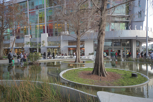
I’m pretty sure they actually went out there and hand-picked the trees.
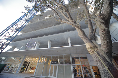
… replete with air plants. They are using some sort of cloth rope to hold them up while they root, not the standard 2×4 treatment.
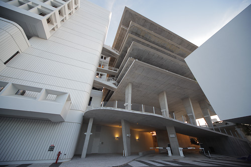
The building is cleverly integrated into the bank structure next door, with a row of retail on one side, and crafty connections on several levels.
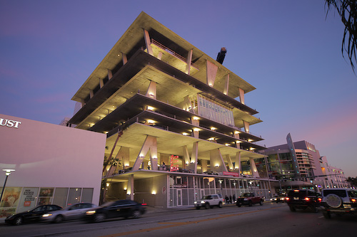
It’s difficult to convey how much the structure dominates the road. It certainly looms over the pretty movie theater, but in a way that I found pretty complimentary.
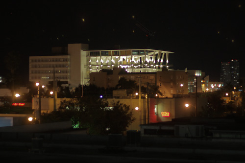
Here’s the view from the Publix parking garage, about a third of a mile away.
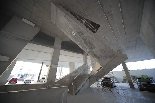
One more look inside at those angular staircases. Here on the second level there’s also a sculpture of angular metal, suggesting that all the supporting rebar in the building is like this.
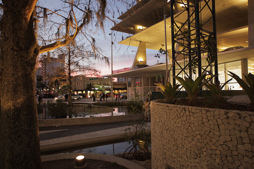
I don’t know how the residents feel, but the people walking around and inside the garage seemed pretty engaged and impressed. People admired the pedestrian details, and there was some walking around and photographing inside the structure.
Thanks for this, Alesh. I’ve been curious as to how the structure would fit in, but it makes sense now. I like it.
The pictures are great, thanks except photo No. 3 gave me a jolt of vertigo.
The planters are spectacular and you are right, they are definitely inspired by the Everglades and BNP. When the trees get their leaves back and the mangroves grow up it’ll be amazing.
Nice photos. I like the third one, too bad there are cars in it.
Definitely like the structure, I’m gonna have to get down there myself and see if I can photograph it.
I live two blocks from the structure. To me it looks like some stage of soviet architecture. I actually like it. But it’s too big for the location and it’s lit up like a birthday cake.
Whaaa? I was expecting some rad new building with 7 floors of stores and restaurants, full of retail and opportunity, and instead we get a fancy parking structure? Ugh. I like the outdoor area, but epic fail for the building, despite it’s interesting looks.
Your more distant pics make me appreciate the structure more. Most people’s experience/view is driving right next to it on Alton Road or walking by the movie theater. As such, it seems overwhelming & out of scale with the immediate environment. That said, the Everglades-inspired parkway below and the interior experience are great.
The extension of Lincoln Road and the landscaping was designed by Raymond Jungles, not Herzog.
The black and white striped paving is a reference to the same design in concrete which is common on Lincoln Road, and is a Lapidus motif. I don’t know who decided to extend the stripes, since they cover the new road and then extend in to the building.
I visited the retail space above and it has a great view of the bay but how or why will shoppers traipse up there? Not a great entrance from the garage either. My objection is strictly concerning the view of the cars parked in the garage, especially the view of the front and rear ends immediately above the very elegant retail stores (isn’t Nescaffe extraordinary?). Perhaps the architects envisioned only lamborginis or at least porshe products only but as a public garage its usually full of SUVs, trucks, or the like and no car, no matter how beautiful, looks good from the angle below. I remember a classic example of this looking at the statue of Lincoln lit from below in Washington as opposed to above. From below its montrous, above its elegant and serious. The landscaping is growing on me though the pavement is dangerous to many, and the new retail is a great addition, especially after an entire block of chain stores to the east. That said I think what makes Lincoln so exciting is the combination of outdoor dining on steriods in front of retail (what drove the Miami Beach commissioners crazy last year). You have great people watching and fun dining and fun window shopping in the same location. The new retai has no restaurants and so that side is not as crowded or as much fun to walk through as the south side where some long suffering restaurants finally have adequate space for outdoor dining, and drinking.
Is the building out of scale? Major, look at how it doesn’t meet up to the old bank building and it dominates the Regal which is one of the best architectural designs on the beach, but it does add excitement, particularly at night. Now lets see how the symphony holds up when it opens (with what promises to be a very mundane and ugly garage).