Came across, just this morning, Daniel Indiviglio’s article about the US debt in The Atlantic. Turns out it’s really high, which you already knew. You may not have realized, however, that it amounts to almost $46,000 for each man, woman, and child in the USA. That’s higher than it’s ever been, natch, but Indiviglio pulled numbers from the Treasury, the Federal Reserve, and a couple of other places, and came up with this fairly terrifying, inflation-adujsted, graph:
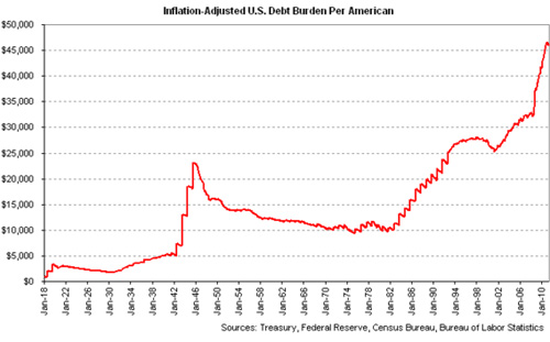
The first spike is World War II, after which we gradually got our act in order, then we start to get cooking through the 1980s in Regan’s neat little yearly oscillations, turn things around under Clinton a little again, crank it up under George W. Bush, and it really starts to spike under Obama. Terrifying.
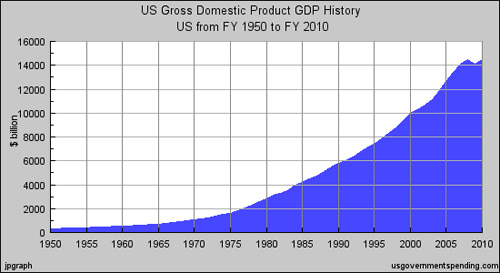
But AHA you say, what’s missing from this analysis is GDP. While inflation’s gone up during all this time, our actual production has also drastically increased, and if we factor for that, today’s debt probably seems much more historically reasonable. Exactly the thought I had. Here’s our GDP by year, at least since 1950 (from US Government Spending, a site that visualizes data from various government agencies):
Here I thought I was going to have to find all the relevant data and create a new chart that combined these two, but it turns out US Government spending has us covered on this one too:
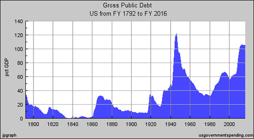
So, yes, we have not yet reached the historical high of national debt per GDP. But we are dangerously close. Remember that during World War II, we had rationing, a draft, restrictions of civil liberties, and all sorts of things that helped the government mobilize the nation’s economic output for the war effort. What we have today, arguably, is 20+ years of an economy built on a series of bubbles, most recently a huge debt bubble. You’ll notice in the graph above that the debt levels off. But that leveling off is based on the Congressional Budget Office’s projections, which are quite a different animal from historical numbers. In fact, the peak on the graph comes in 2013, and the leveling off begins in 2014 or 15. Not encouraging.
None of which is to say that we’re doing the wrong thing by aggressively borrowing in the interest of fixing the economic mess. But I think that people like Paul Krugman, who for months has been writing a weekly screed about how idiotic our politicians are for giving lip service to prioritizing debt reduction higher relative to economic stimulus, should grapple with this reality a little bit. Acknowledge that while our debt is not technically at a historical high point, it is indeed very very high. And frame his argument for why we should be increasing it at an even steeper rate in terms that are proportional to the scope of the problem.
Krugman HAS done this numerous times, pointing out that the reduction of the nation’s debt is best achieved when the nation is working — earning, spending, saving, etc., and when larger incomes and corporations are taxed more fairly than the middle class.
TL;DR “Too much debt, zOMG!” So, what else is new? Worry about the current game of debt ceiling chicken instead.
Actual Response:
Why all the hand wringing over the debt? Debt can be managed, stop pitching softballs to Tea Baggers. Also, reducing government debt doesn’t increase employment, and the lack of jobs is what fuels fear and loathing in the current recession.
What you should be worried about is the brinksmanship in DC over the debt ceiling. If they fuck up that game of chicken, then we’re talking default and the downgrading of government bonds, so we end of having a harder time selling our debt on the market. Now that’s something worthy of charts and words.
In an unreleated swipe:
The Shuttle launched for the last time today. Shouldn’t you be dancing on its grave? Pissing on the NASA logo? C’mon, Alesh, gimme that old time anti-space program religion.