Category: Technology
How to not win the Picture of The Year in Denmark
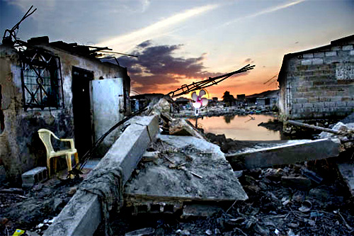
Photojournalist Klavs Bo Christensen was recently disqualified by the Danish Union of Press Photographers from their Picture of the Year prize due to “excessive Photoshop” (via). After the committee reviewed the pictures, they requested his original camera RAW files, before making the determination. Lucky for us, they released a few of the before/after images. Let’s look at one:
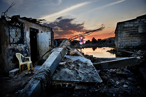
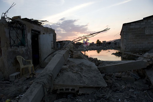
This looks like a pretty spectacular modification, but I decided to see just how much was really being done by attempting to re-create the changes myself. Feel free to fire up Photoshop and play along at home.
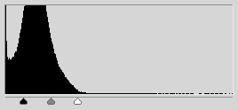 Step 1: Obviously the cornerstone of what’s happening is an increase in contrast. The levels tool allows a photographer to adjust lightness and contrast in a single step. And this single adjustment resulted in the above — an increase in contrast has the natural effect of increasing color saturation, because the contrast is being increased in the individual color channels.
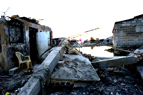
Step 2: Since the ground in the original image is in shadow, the sky is of course much brighter (this is a common issue in outdoor photography), and it’s now blown out. The solution is to mask the above layers adjustment so that it only effects the ground.
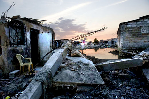
 Step 3: Better, but the sky still looks anemic relative to the rest of the picture, so we apply a second levels adjustment to the areas unaffected by the first. This time the sliders are toward the right of the graph — the contrast is increased by about the same amount, but this time the overall exposure is darkened rather then lightened. Now the image is just about identical with Christensen’s.
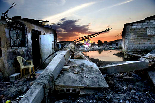
Step 4: Finally, dodged the chair and the window above it just a little, and sharpened the overall result. Save for some nasty jpg compression resulting from modifying images already compressed for the web, the results are remarkably close.
Conclusion: I’m not trying to say that because Christensen’s modifications are trivial to make his photos were disqualified unjustly. Anyone who’s ever played with an image manipulation program and found the contrast adjustment knows it’s trivially easy to make a photo look completely insane and artificial. The question is, how much contrast adjustment is appropriate before an image leaves the realm of photojournalism. Christensen is correct that referring to RAW files is misleading, since digital cameras have their own contrast adjustment, and the RAW files often produce deliberately low-contrast results which do not correspond to the way a scene looked. Additionally, human vision corrects for variations in lighting when looking at the world in a way that it does not adjust for viewing photographs.
What’s striking is the ignorance of digital photo manipulation from the committee. They speak of a wall and some concrete that the photographer has colored blue, which is just wrong — the increase in contrast has brought out the blue shade that was present in the original photograph. A photographer who applied a gentle, more pragmatic levels adjustment would have achieved a commensurately modest shade of blue (which after all is the color that gray concrete takes on in shadows of the early-morning sun). The exact same process is at work in the case of the sweater that appears to turn from brown to red.
I do not deny that for me this set of Christensen’s images crosses the line, but I note that his transgression is a quantitative one, not a qualitative one. His use of masking to modify only one area of the photo was used exclusively to separate the sky from the foreground, a technique no doubt used commonly by photojournalists. So the complaint here can be summed up as “too much stupid contrast.”
(By the way, check out Christensen’s website. Few of the images there exhibit this effect, though the black and white images seem again to be suspiciously high-contrast, to their apparent detriment. His photos of masked Iranian women, however, are spectacular.)
How to make an e-reader
 Everybody’s raving (via Fimoculous, where I first typed most of this out) about the Kindle, and I do not doubt their sincerity. But neither Amazon nor Sony have quite figured out what they need to make. These devices are the Treo of five years ago — good enough to be loved, but about to be made irrelevant by the coming iPhone.
No matter how good the Kindle is, it is patently absurd to pay $2.50 per month to read Slate on it. And Bezos should be blushing at the contortions people go through to get PDF on their Kindles. The point here is that mostly what people want on an e-reader is not books — it’s the internet, stupid.
So, what do we want? Simple: a Kindle form factor with the guts of a Dell Mini, and a little sprinkle of iPod Touch. It goes roughly like this:
Intel Atom processorARM processor, 16 GB internal storage, SD card slot- WiFi, vestigial keyboard
- Ubuntu: just enough to run Firefox full-featured and an mp3 player
- Color e-ink display (I’d settle for an LCD)
- Touch-sensitive screen
- What the hell: compatible with Amazon’s e-book format
The Kindle is $350, as is the new Sony reader (which has the touch-sensitive screen). The Dell Mini starts at $199. The 16GB iPod Touch is $300. Come on hardware makers, you can do this.
Update (4/13/09): TechCrunch is working on it.
Available online for free
Weekendly clickables VII
- That idiot Bezos was on the Daily Show last week hawking the new Kindle, and raving about how great it is that it can read books to you, and within a few days disabled that feature for publishers that ask. What a punk. I came within a breath of owning a Kindle 1 last year, and while I’m sure it’s a great device, I’m holding out for something I can surf the web on without a hassle. And something that can read PDF and text documents without having to e-mail them to Amazon to be converted. Good grief. Update: Well, now this is interesting.
- The new do it yourself culinary movement in Brooklyn (via)
- WOW: badpaintingsofbarackobama.com (via)
- Emigre Typetease. Also, 22 most used free fonts. And maybe also the ‘Good Typography is…. everything’ shirt.
- Translating ‘The Economist’ Behind China’s Great Firewall
- Miami filmmaker Clifton Childree harrased by code enforcement about a film set in his back yard.
- Using Mathematica for graphic design (via)
- Haha — the Outlook Attachment Reminder gives you a warning when you hit “Send” if you have the word “attachment” in your e-mail but no attachment. You probably need this.
- Attention Nikon DX owners (D40, D300, etc.) — you need this.
- Times Online’s Best 100 blogs.
- What single book is the best introduction to your field (or specialization within your field) for laypeople? A staggering list.
Mac vs. Windows part 1
So, we got an iMac at work. I’ve used Macs before, but I was particularly interested in whether I could get it to talk to our Windows network, and how much prodding it would take. Our network is a little squirrely, and getting a new Windows machine to talk to it is always a bit of a hassle (and occasionally brings seasoned IT pros close to tears). Well, I plugged in a cable, turned on the iMac, clicked the hard drive, and there it was: all the computers on the network just showed up in the sidebar. I clicked on one, entered a password, and from then on everything worked seamlessly. It hasn’t asked for the password again since.
So, screw you, Microsoft. On other thing. 5 years passed between Windows XP and Windows Vista. You employ like 100,000 people, right? And like a third or something are working on Windows? Well, I see where Vista is an improvement and everything (frankly, it’s got tons of things wrong with it, too), but aside from the cosmetic stuff the changes are really pretty modest. What the hell have you people been doing all this time?
Megapixels
 How many megapixels do you need? Well, for most people, as I said in my camera buying guide, the answer is 6. But what if you’re an artist, and you’re making big prints and trying to approximate the effect of using a medium or large format camera? How many megapixels of digital resolution would you need? This has always been a moot point, because the answer was “much more then any digital camera has.” But with the introduction of the Canon 5d Mark II and the Nikon D3X (21 and 24 megapixels, respectively), it deserves to be revisited.
Online photographer takes an analytical approach, attempting to determine what, for an 8 × 10 inch print, constitutes the highest theoretically possible resolution. The answer: 100 megapixels. Maybe. (It might also be 400.) Ken Rockwell compares the D3x to 35mm film and determines them to be very close in resolution. But we’re not interested in an 8 × 10 inch print, and we’re not interested in matching 35mm film. We’re interested in matching big prints made from medium and large format cameras.
I’ve spent a lot of time looking at these big prints (recommend visiting the Margulies for a near-lethal dose). It seems to me that in the best of the 30 × 40 inch prints, the resolution on an per-square-inch basis nears that seen magazines images. Since magazines typically consider 300 dpi to be the minimum resolution for print, it’s easy to calculate 30 × 40 × 3002 = 108,000,000 — 108 megapixels.
But looking at real-world results belies the mathematical precision that is suggested by talk of dots per inch, etc., and the fact is that the actual resolution of those large format print-based prints also varies greatly. This has everything to do with the subject matter, and in what an artist considers acceptable. A 6 megapixel image printed 16 × 24 inches is 120 dpi, yet looks surprisingly good. (A print from the D3x at the same resolution would be 34 × 50 inches.) It’s imperative for each person interested in this to familiarize themselves with what 100 dpi, 150 dpi, etc. looks like for their subject matter, and with today’s technology it’s trivially easy to do this.
Just for fun, check out the picture above. It’s a tiny crop from a picture off my Canon pocket camera, scaled up by 150%. Not fantastic, but at this resolution (assuming a 100 dpi monitor), a print of the whole picture would be 50 inches across.
Micropayments
The world internet is abuzz with talk about this weeks’ Time cover story advocating micropayments for online content. Rex Sorgatz even put together a really smart model of how they might work.
The problem, for those not following along, is that newspapers and some magazines are dying, loosing revenue from their print editions (because they didn’t play nice with the internet early on), and they think this (i.e. not playing nice with the internet now) is going to be their salvation.
It’s not going to work, and Clay Shirky has done a great job of explaining why (via). Essentially, because people pony up on micropayments only when they have no other alternative. The only way for this to succeed is for the New York Times (or whoever) to convince all similar content providers to implement a micropayment system system at the same time.
For those following along at home, I’ve made two of my own proposals for saving the newspaper industry over the years: the non-profit model, and the break it up and rebuild it model (see comment #2).
Obama’s Blackberry
Everyone has been on the edge of their seat waiting to hear if Obama would be allowed to keep his Blackberry. The Answer: he gets a brand-new, customized Blackberry with a “super-encryption package.” (via rainey305)
AOL shuts down scores of user websites with minimal warning
A fitting near-conclusion to a disgraceful history: AOL shuts down scores of user websites with minimal warning. And Jason’s right — everyone spending hours and hours on Facebook is risking the same fate. There need to be laws for how sites hosting user content are shut down, just as there area laws governing physical evictions. (via Waxy)