Is there anyplace in Miami that still develops large-format film?
Category: Photography
The Online Photographer’s top camera
The Online Photographer has been counting down its top 10 recommended cameras. #1: Nikon D700.
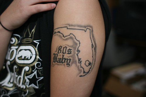
80s Baby
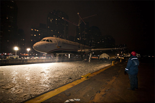
Images of flight 1549 recovery
Images of Flight 1549 recovery: Stephen Mallon was hired to photograph the recovery of US Airways Flight 1549, and was subsequently blocked from releasing the images by some asinine legal crap. Anyway, the images are back online, and every single one sings. Truly a spectacular body of work.
How to not win the Picture of The Year in Denmark
Photojournalist Klavs Bo Christensen was recently disqualified by the Danish Union of Press Photographers from their Picture of the Year prize due to “excessive Photoshop” (via). After the committee reviewed the pictures, they requested his original camera RAW files, before making the determination. Lucky for us, they released a few of the before/after images. Let’s look at one:
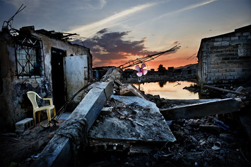
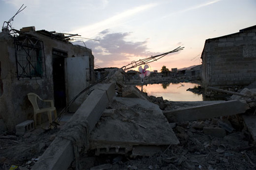
This looks like a pretty spectacular modification, but I decided to see just how much was really being done by attempting to re-create the changes myself. Feel free to fire up Photoshop and play along at home.
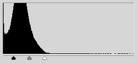 Step 1: Obviously the cornerstone of what’s happening is an increase in contrast. The levels tool allows a photographer to adjust lightness and contrast in a single step. And this single adjustment resulted in the above — an increase in contrast has the natural effect of increasing color saturation, because the contrast is being increased in the individual color channels.
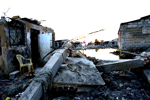
Step 2: Since the ground in the original image is in shadow, the sky is of course much brighter (this is a common issue in outdoor photography), and it’s now blown out. The solution is to mask the above layers adjustment so that it only effects the ground.
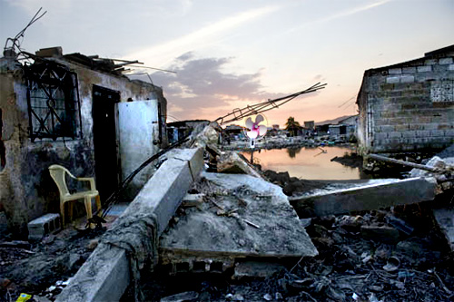
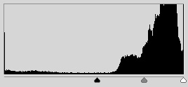 Step 3: Better, but the sky still looks anemic relative to the rest of the picture, so we apply a second levels adjustment to the areas unaffected by the first. This time the sliders are toward the right of the graph — the contrast is increased by about the same amount, but this time the overall exposure is darkened rather then lightened. Now the image is just about identical with Christensen’s.
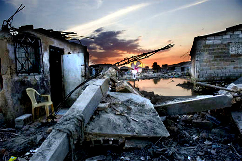
Step 4: Finally, dodged the chair and the window above it just a little, and sharpened the overall result. Save for some nasty jpg compression resulting from modifying images already compressed for the web, the results are remarkably close.
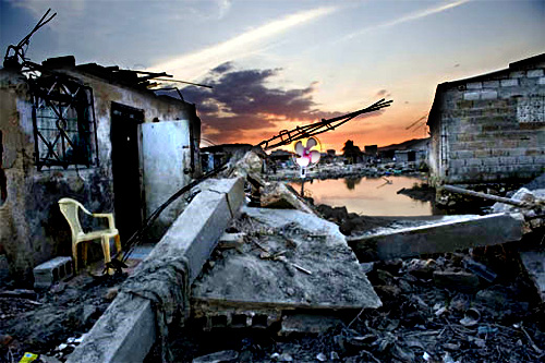
Conclusion: I’m not trying to say that because Christensen’s modifications are trivial to make his photos were disqualified unjustly. Anyone who’s ever played with an image manipulation program and found the contrast adjustment knows it’s trivially easy to make a photo look completely insane and artificial. The question is, how much contrast adjustment is appropriate before an image leaves the realm of photojournalism. Christensen is correct that referring to RAW files is misleading, since digital cameras have their own contrast adjustment, and the RAW files often produce deliberately low-contrast results which do not correspond to the way a scene looked. Additionally, human vision corrects for variations in lighting when looking at the world in a way that it does not adjust for viewing photographs.
What’s striking is the ignorance of digital photo manipulation from the committee. They speak of a wall and some concrete that the photographer has colored blue, which is just wrong — the increase in contrast has brought out the blue shade that was present in the original photograph. A photographer who applied a gentle, more pragmatic levels adjustment would have achieved a commensurately modest shade of blue (which after all is the color that gray concrete takes on in shadows of the early-morning sun). The exact same process is at work in the case of the sweater that appears to turn from brown to red.
I do not deny that for me this set of Christensen’s images crosses the line, but I note that his transgression is a quantitative one, not a qualitative one. His use of masking to modify only one area of the photo was used exclusively to separate the sky from the foreground, a technique no doubt used commonly by photojournalists. So the complaint here can be summed up as “too much stupid contrast.”
(By the way, check out Christensen’s website. Few of the images there exhibit this effect, though the black and white images seem again to be suspiciously high-contrast, to their apparent detriment. His photos of masked Iranian women, however, are spectacular.)
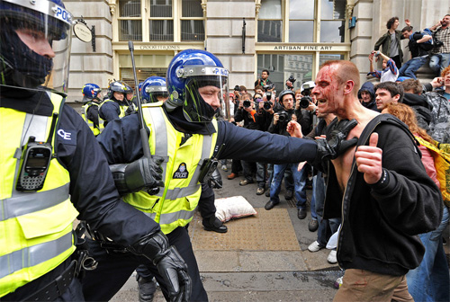
G20 protests in London
G20 protests in London. It’s interesting how three groups are on near-equal footing in these image — the protesters, the police, and the photographers. Not only do the scenes have a quality about them of being staged for the photos, but it’s almost like all parties got together with the sole purpose of creating a previously agreed-upon set of images. I realize that sounds cynical, and that the protesters are extremely passionate and the police are doing a very difficult and dangerous job (as are the photographers), but it’s a very difficult feeling to escape with this particular set of images.
Megapixels
 How many megapixels do you need? Well, for most people, as I said in my camera buying guide, the answer is 6. But what if you’re an artist, and you’re making big prints and trying to approximate the effect of using a medium or large format camera? How many megapixels of digital resolution would you need? This has always been a moot point, because the answer was “much more then any digital camera has.” But with the introduction of the Canon 5d Mark II and the Nikon D3X (21 and 24 megapixels, respectively), it deserves to be revisited.
Online photographer takes an analytical approach, attempting to determine what, for an 8 × 10 inch print, constitutes the highest theoretically possible resolution. The answer: 100 megapixels. Maybe. (It might also be 400.) Ken Rockwell compares the D3x to 35mm film and determines them to be very close in resolution. But we’re not interested in an 8 × 10 inch print, and we’re not interested in matching 35mm film. We’re interested in matching big prints made from medium and large format cameras.
I’ve spent a lot of time looking at these big prints (recommend visiting the Margulies for a near-lethal dose). It seems to me that in the best of the 30 × 40 inch prints, the resolution on an per-square-inch basis nears that seen magazines images. Since magazines typically consider 300 dpi to be the minimum resolution for print, it’s easy to calculate 30 × 40 × 3002 = 108,000,000 — 108 megapixels.
But looking at real-world results belies the mathematical precision that is suggested by talk of dots per inch, etc., and the fact is that the actual resolution of those large format print-based prints also varies greatly. This has everything to do with the subject matter, and in what an artist considers acceptable. A 6 megapixel image printed 16 × 24 inches is 120 dpi, yet looks surprisingly good. (A print from the D3x at the same resolution would be 34 × 50 inches.) It’s imperative for each person interested in this to familiarize themselves with what 100 dpi, 150 dpi, etc. looks like for their subject matter, and with today’s technology it’s trivially easy to do this.
Just for fun, check out the picture above. It’s a tiny crop from a picture off my Canon pocket camera, scaled up by 150%. Not fantastic, but at this resolution (assuming a 100 dpi monitor), a print of the whole picture would be 50 inches across.
Taking a photo of something as it’s happening
There is a whole body of literature, going back at least to Susan Sontag, that argues against photography. The process of making a photograph distracts you from experiencing the thing itself, distorts the relationship between subject and the viewer, and creates a visual record that is inevitably later perceived as somehow more real than memory. To be honest, I’ve always found these sorts of arguments to be overblown. I let instinct be my guide about when to bring a camera with me (almost all the time) and when to use it. And I couldn’t honestly tell you of a time when I regretted making a photo because of the imposition it created on the experience.
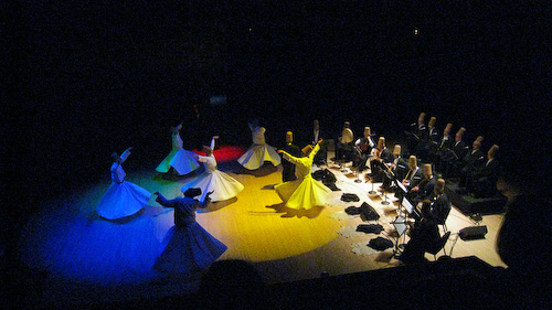
Until this weekend. The Whirling Dervishes of Rumi performed (actually I’m not sure that’s the right verb) at the Arsht Center, and I had a relatively great box seat. The way this works is that the evening is over two hours long, opening with a musical performance, explanations of the meanings of the dance, a movie, more music, then the solemn entrance of the Mevlevi themselves, followed by the actual ceremony. The point is that there is a major buildup of a particular type of a solemn mood, which elevates the already daunting trance-like spiritual weight of the event.
So I wasn’t going to take a picture. And then all these other idiots started in. Now, photography is “strictly prohibited” at the Arsht Center, and having worked around the performing arts I know that the two primary concerns are (1) your photographing distracts the person next to you, and (2) the flash, stupid, which distracts everybody, most especially the performers (which in the case of dance is actually dangerous). Needless to say that there were at least a dozen camera flashes from around the audience. So first of all, you people are stupid. You haven’t read your manual, you don’t know how to control the camera, you have no regard for anyone else but yourself, and you did not get a photograph, because your flash covers approximately three meters (10 feet), and you weren’t sitting in the first few rows (thank Jesus).
But so somehow these idiots made me think that my taking a picture the right way (ISO set to maximum, exposure compensation -2 stops, flash off, autofocus assist light off, sound disabled, continuous shutter on) was somehow permissible. I held my shutter down for about a second, got three frames, and put the camera away. And yes, the moment was destroyed. But you know what? It came back. The thing is that if you’re discreet about this (my friend sitting two seats down didn’t know I took a picture until I showed her later afterward) it’s really not that big of a deal.
There is something to be said here about the trade-off between imposition of technology and quality of photograph (contrast the ubiquity of the cell phone with a 4×5 camera), but mostly a pocket camera is a decent trade off.
The thing that it comes down to for me is that looking at a photograph years later brings back the memory of an event more vividly than anything else. There are many reasons for making a photo, but the marking of something as worthy of vivid memory is perhaps the best.
New Year’s Day Absinth
Ken Rockwell’s How to Win at eBay article
Ken Rockwell’s How to Win at eBay article should be worth a read.
