Recently, William Saletan published The Conversion, a wonderful story about the evolution of Mitt Romney’s views on abortion rights. It’s exhaustively researched and long: some 13,000 words, including a video summary and detailed infographic. It spells out revealing information about how Romney processes important political decisions, and sheds light on how complicated and large-looming the politics of abortion are in the US, equally obsessed with religion and personal liberty. It’s the sort of story that so many readers still seek out and cherish, as evidenced by sites like Longform.org, which aggregate relatively long pieces of journalism.
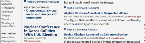
But had you come across the story on Slate’s home page, you would have no way from distinguishing it from, say, this article, a 200-word quick-hit entry about the cars the Romney family drives. The abortion article may have been longer featured on Slate’s home page, and it certainly received more attention on the internet, but a browser of the Slate website or RSS feed would have no way differentiating between the relative weights of these two articles without clicking through.
As we transition from print to online media, this is one of the huge challenges that has yet to be overcome. Reading a physical newspaper is a very particular experience, in part because experienced layout people hand-design every page to give prominence to the material that’s deemed most important, but mostly because you can usually see which articles are longest. The full text of the article is right there. And while attempts to bring a print-like layout to the web have mostly failed, the reader’s need to know what lies behind each link as they scan a web page remains. Many websites have done a good job of identifying links that lead to photo slideshows, infographics, and video content, but for ordinary stories there is no way to tell how long the article is, how much effort the reporter has put in, or how long it’ll take to read.
It’s fantastic that, contra some predictions, the internet has not reduced all online reporting to short blog posts. But making long articles impossible to dinstinguish from short ones places a burden on readers, who treat articles of different lengths in different ways. Many of us spend the morning gobbling short items in large volume in an effort to stay up to speed with the day’s events “water-cooler” topics. We often save longer articles to services like Instapaper and Read it Later for more relaxed reading, perhaps an after-dinner session on an iPad.
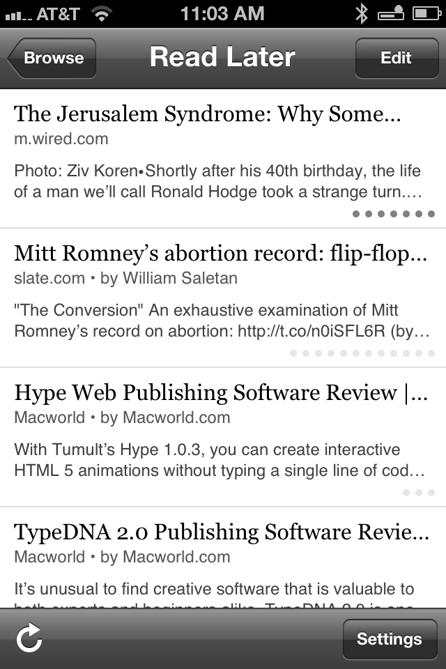
Fundementally, this problem is not difficult to solve. When I designed The Heat Lightning, I incorporated into the traditional blog format a word count for each “read full article” link. The site Longreads provides not just a word count, but an aproximate reading time for each article it aggregates (based on approximately 265 words per minute). A minimal but elegant solution is on display in Instapaper’s iPhone app. A series of gray dots below the short summary of the article indicates aproximate length, three dots for short articles up to a dozen or so for epic pieces. It’s simple and easily scanable, but doesn’t convey the information in a precise way. Then again, you don’t get an exact wordcount by scanning the layout in a printed newspaper either — just a rough visual sense of its length.
As we transition from print to online media, features like these become essential. It’s possible to flip through an entire edition of a daily paper, scanning headlines, skimming some articles and reading others, over breakfast. The same is not true of digital newspapers, because every story is on its own page, and even on a fast internet connection pages take a couple of seconds to load. A typical newspaper home page has hundreds of links, so the inflection point is the click itself. We’ve got a headline and a few lines of summary text in which to make the decision to take the plunge or not.
What we need here is some way to see just a little more of the story before committing to clicking through. Why not show the first couple of paragraphs of a story when the reader’s mouse pointer is over the headline? (The same effect could be accomplished on a tablet by pinching open.)
Over the last five years, many publications have intelligently revamped their websites, creating useful information hierarchies, usable navigation systems, and easily readable content pages. But as we use Twitter and recommendation tools like Longform more and more to find articles to read, the home pages of many publications’ websites are falling into disuse. Adding tools like these, that take into account how readers consume content, would do a lot to make these pages more useful.
what it mister
watch it